Visual template design
Template Editor is the central tool for designing templates. You can either modify an existing template or create a template from scratch.
Check our public templates before you start designing your own template.
Layout Fundamentals
Template Editor supports two modes of operation:
- Visual template editor (default)
- Source code editor
When you open a template, you will always see the visual mode first.
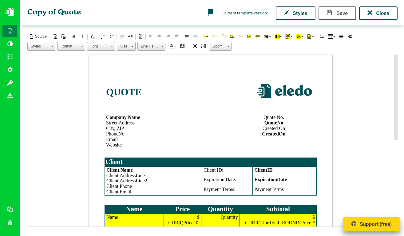
Visual mode resembles in many ways modern text editors like Microsoft Word. It has a toolbar with standard components allowing you to insert standard elements like text or image. It also contains components that change appearance of the elements (font size, alignment, ...), and finally the toolbar contains Eledo-specific components like a Text Box.
At first sight you might assume that you can place the elements anywhere on the page. But this editor looks a bit differently.
Visual editor is just a convenience layer on top of a source code (HTML) editor. If you are familiar with HTML basics, this will help you enormously during template design.
First thing to remember is that the content is always inserted at the current position of the cursor — whether you're inserting a dynamic component or simply write a text.
Handling text lines
If you just want to insert a simple text, you can simply write it and it will be shown on the screen.
Under the hood, each line is represented by a HTML paragraph:
<p>First row</p>

<p>Second row</p>
You can create a new paragraph by hitting Enter key.
Paragraphs, however, are not always what we want. By default, they leave a lot of space between rows. If you want to display a block of related text, e.g., a company address, it is better to use line break <br>.
Eledo currently doesn't allow to add line breaks visually. You have two alternative options:
- Add line breaks in the source editor (recommended for advanced users)
- Create a new line with
Shift + Enter
Handling multiple elements at the same row
It is easy to get stuck when you want to design something more advanced.
Let's imagine that you want to design a template that has some Title on the left and a logo on the right. As we mentioned, you cannot just place the logo to the right.
HTML table is the fundamental design element.
What we need to do is insert a table with one row and two columns. You can use the toolbar icon Table.

By default, this table has a fixed width and visible borders. Right-click at the inserted table and select Table Properties from the context menu.
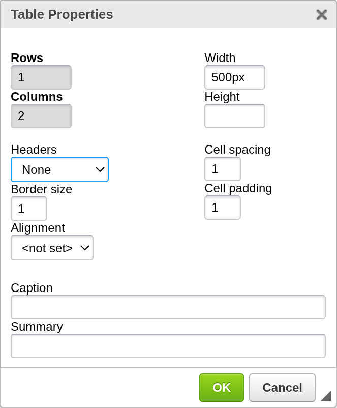
In table properties you can remove the border by setting Border size to 0. Also, you can change the width of the table. You can either set the width in pixels or in percents to make the layout dynamic. If you set Width to 100%, it will expand to fill the whole width of your template.
You might create a table with as many columns as you need but the rule is to keep it simple.
After the table is created, you can place the elements inside the table. These elements can be positioned relatively to the table column - left, right, center, justify.
Design Concepts
When designing templates, always think in terms of grids.
If it helps, create a sketch of your future template with pen and paper.
Then, take a pencil and split the sketch into paragraphs (simple text rows) and tables (more elements in the rows).
You might even make a note like table 3x2 (three columns, two rows).
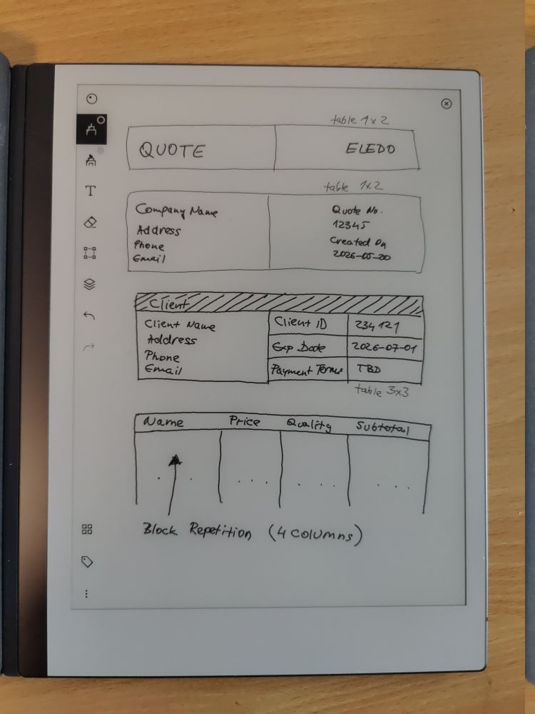
Once you have the template sketched, with these notes, layouting will be much easier for you.
Even the most complex template can be divided into tables with columns and rows.
DIV container
In toolbar, you can find a button Create Div Container. DIV container helps you group related elements into one logical block. For example, you can group a paragraph with heading text and two tables into one container. Then you can apply CSS styles to this DIV container. For details, look at the DIV Container document.
DIV container is available for advanced users.
Showing blocks
You can use Show blocks icon to display invisible blocks like paragraphs or borderless tables. This feature is also mostly for the advanced users.
Styling text and components
Once the components are placed into the template, you can style them individually.
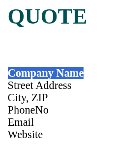
Simply use the cursor to mark the whole text part and then in the toolbar pick the style, font, font size or any other attribute you want.
Source editor
Source editor was made available for advanced users who know HTML basics. If you are not familiar with HTML fundamentals, we recommend to stay with the visual editor.
You can switch between visual and source editor with the Source button at the top left corner in the toolbar.
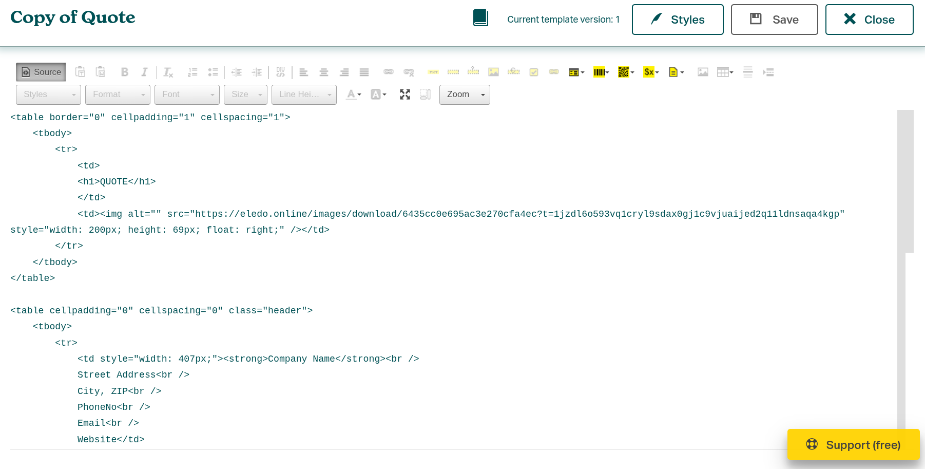
Any changes in the visual editor are shown in the source editor and vice versa.
The primary advantages of the source editor are transparency and customization. You can directly see the layout and tweak it. Also, it is possible to generate HTML code elsewhere and just paste it here instead of painfully layouting in the visual editor.
In source editor mode you can also insert custom CSS classes and apply custom styles to further tweak the visual side of the template.
Styles
In the top right corner you can find the Styles button. It opens the Styles editor that allows you to further customize the template design.
We're discussing this feature thoroughly in a separate document.
Applying custom CSS styles is made available for advanced users.